The Laundry Room Venue
The Laundry Room Venue is an up and coming music venue born from a converted laundry room. They built a stage in the laundry room to put on concerts but the space is also able to be rented for private events, band rehearsals, and parties. It is a good budget option for people who want to put on a cheap show with professional quality. The venue currently thrives off of word of mouth interactions but wants a responsive website to establish an online presence.
Overview
Challenges
The Laundry Room Venue’s is an existing business, whose only online presence is in the form of their social media outlets. They want a responsive web site that communicates what their business has to offer and facilitates transactions. The Laundry Room Venue already has a logo but needs some additional branding.
Solutions
Design a visual direction that matches the brands adjectives.
Research the industry to find patterns and consumer needs.
Build a responsive website
Role:
UX Designer
UX Researcher
Interaction Designer
UI Designer
Duration:
4 weeks
Team:
Brennan Cleveland (Myself)
Alan Hurt Jr (Mentor)
Other UX Designers (Group Crits)
Tools:
Sketch
Invision
Adobe Illustrator
Pen + Paper
Trello
Airtable
Empathize
Research Plan
At the start of the project I knew it was important to set forth some goals for my research. This helped me to stay on track while performing research. These goals were 1) to determine working patterns in existing ticket buying sites, 2) to learn what drives users who are browsing venue sites to purchase tickets to events, 3) to determine what factors lead to a pleasant ticket buying experience, and 4) to find pain points in the businesses current state of operations. After deciding on the goals of the research I sat down and chose what methods I was going to use to research these. These research methods were:
Secondary Research
Market Research
Competitor Analysis
Primary Research
1-on-1 Interviews
Market Research
I wanted to learn more about the live music industry and the ticket purchasing process. To do this I went online and utilized search engines to seek out as much information as I could find.
Trends
Music ticket sales were at $6,859.0 million in the US (2019) & are expected to grow by 6.5% in 2020
52% of Americans attend live music shows (because of this America is ranked #1 in the world in live event revenue)
30.5% of live music attendees are between the ages of 25-34 yrs old
Based on music festival demographics the market is 59% male and 41% female
70% of hardcore festival goers (6 festivals per year) say they are their friends primary resource for information on live music events.
Primary reasons attendees prefer to buy tickets online are:
Good deals or discounts
Convenience
Securing tickets before the show is sold out
Ability to see information about the show or venue
For free events 45% of people get tickets at the door
50% of people who reserve tickets to free shows online do not show up to the event
For paid shows less than 20% of people buying tickets at the door
Reasons artists choose venues:
58% said it was because the venue came up when they searched through search engines
34 % said online venue marke places
Both of these reasons were ranked above social media
The only reason that was listed above these two was “word of mouth”
Pain points artists have expressed in selecting a music venue is:
Slow response times from venue
a lack of flexibility from venue when it came to decisions
not being transparent in terms of rules or costs
not giving enough information upfront
Pain Points
Scalpers purchasing tickets just to resell them at higher prices
Hefty service fees when purchasing a ticket
Slow response time from venue when contacted
Venues not being transparent in terms of rules or costs
Competitor Analysis
With a general idea of the consumer base in the live music industry, I decided it was time to do a competitor analysis. I wanted to utilize this opportunity to study how competitors were utilizing their website to drive transactions. While looking at competitors websites I took note of the things they did well and things that came across as weaknesses. While choosing direct competitors I looked for medium to small music venues in an hour radius. To choose indirect competitors, I looked at a large scale historical venue within an hours drive and Ticketmaster a large scale ticket sales website.
Provisional Personas
Before I started interviewing prospective consumers, I felt it was important to decide what kind of users I wanted to interview. This helped direct the search for people to interview. The provisional personas can be found here.
1-on-1 Interviews
For the interview phase, I really wanted to find out what caused frustration in the average user as they went about the ticket buying experience. I also wanted to learn about motivations and frustrations for artist’s reserving a venue. Unfortunately, due to the limited time allotted for the research phase in the design sprint and the lack of response from previous artists who have performed at the venue, I had to decide to focus on just consumers who have purchased tickets recently. I ended up interviewing 6 users about their previous experiences and pain points. Through this I was able to find some insightful information. The interview transcripts can be viewed here.
Empathize
Empathy Map
After completing interviews I wanted to compile my findings into a format that helped me empathize with the user. I chose to do an empathy map because being able to write down all the points users made, organize them and reorganize them helped me find patterns among what users did and said. I began by initially organizing the points in terms of the user’s senses they appealed to and whether it was a pain or a gain. Afterwards I compiled all like elements into different sections. Using those sections I derived some insights. Utilizing those insights, I found some needs
Insights
A significant portion of users found out about concerts through social media or emails they subscribed to.
Users liked having mobile access to their ticket because they felt they would lose a physical one.
Participants took local restaurants and lodging into account when deciding if a ticket was worth buying.
Participants were frustrated with fees tacked on at the end of ticket purchases.
Needs
A way to subscribe to updates from the venue.
Digital access to tickets.
Information on the area of the venue.
Transparent pricing on shows
User Persona
I felt that having some insights and needs was really helpful for finding what I needed to design solutions for. I did feel, however, that while these lists were very helpful, they weren’t very easy to empathize with. To remedy this situation I created a persona of a potential user. This allowed me to personify the needs of the user in a way that was easier to empathize with. I did this by notating their needs, frustrations, motivations and goals.
Ideate
HMW Questions/ POV Statements
After finding the core needs of the user from my interviews, I wanted to formulate those needs and insights into a format that was easier to design solutions for. This led me to creating some HMW Questions and POV statements. These elements helped create a question that was easier to design solutions for.
Brainstorming
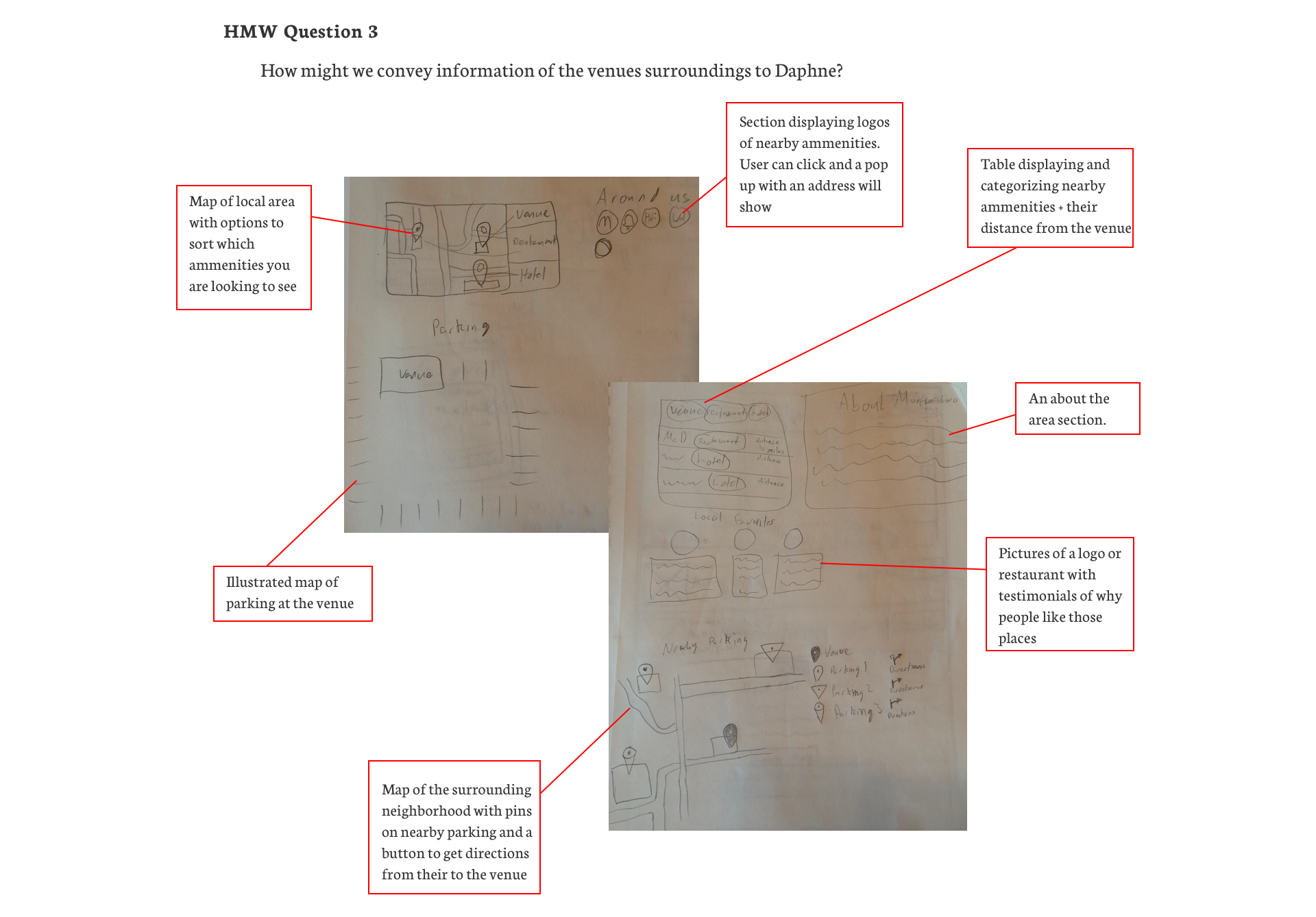
Instead of moving straight to designing a solution, I wanted to try to find multiple possible solutions to the problems set forth. What I ended up doing was, setting a timer for 3 minutes and sitting down with some pencil and paper. One need at a time, I would use that 3 minutes to sketch as many possible solutions as I could think of. I would then go through all 4 of my needs using this process. After going through all 4 needs, I repeated the process one more time. Here is an example of what a brainstorming session looked like. The rest can be found here.
Project Goals
After brainstorming some possible solutions, I felt it was important to lay out the users goals, business goals and technical considerations in a chart. By doing this I was able to make sure the things I designed benefitted both the company and the user.
Feature Roadmap
With the users goals and the business’ goals laid out. It was time to think of some features this website would need or would benefit from having. I prioritized these features based on their importance and gave a reasoning as to why they were prioritized where they were. The roadmap can be viewed here.
Site Map
When it came to deciding how to organize the web site I decided to look at what competitors were doing for organization. I decided the best way to approach organizing this website was by studying and utilizing existing patterns consumers are already used to operating in. Site map can be viewed here.
Task Flow
I decided to start off by making a simple task flow of how a user could find a concert based on a day they had available.
User Flows
After looking over the task flow diagram, I wanted to delve deeper into how a users decisions dictated their path across the website. Next time I make task and user flow diagrams I will use the task flow to indicate a main task the user needs to complete on the website. Then with the user flow diagrams, I will break the task flow down into more depth and analyze the decisions the user makes within it. Other user flow diagrams can be found here.
Design
Low Fidelity
I decided on this project to create my sketches while also incorporating elements I saw other music venue websites using. Unfortunately, a large majority of music venue websites look very outdated or are extremely barebones. Fortunately, since I initially chose to sketch out my first wireframes, I had the opportunity to see which elements worked and which ones looked outdated.
Medium Fidelity Wireframes
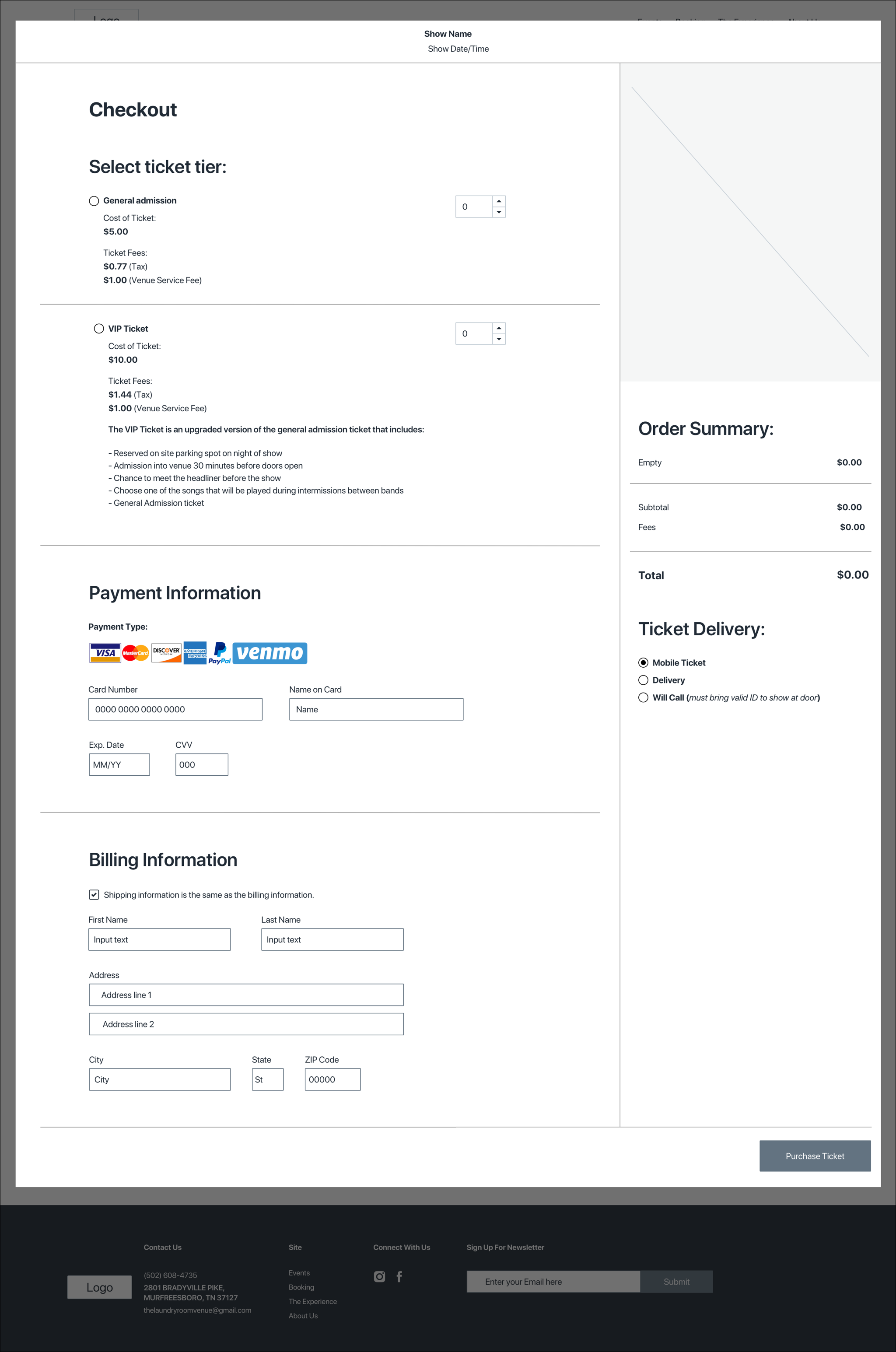
After looking over the decisions I made on my low fidelity wireframes, I decided I need to update some of the elements so the page would look more modern. I wanted the web site to maintain the same high level of functionality while also having the utmost visual appeal.
Responsive Mid Fidelity Wireframes
I wanted to see how these would translate to other formats like tablet and mobile. To do this I created some responsive wireframes of the pages I created. I set a grid to an art board the size of the format I was creating for and moved elements so that they fit well. The responsive wireframes can be seen here.
Prototype
Mid Fidelity Prototype
Using the mid fidelity desktop prototypes I created a prototype. I wanted to be able to test a few things that correlated with the basic function of the sites and some needs that came from the interviews. I focused on the ticket buying experience, signing up for an email newsletter and finding food near the venue. Testing the mid fidelity wireframes gave me the opportunity to see if my designs made sense to users.
Usability Test
Before I started testing users I wanted to lay out a plan. This helped me present the test to users in a way that was easy to understand. I chose these tasks for users to complete because I wanted to make sure it accomplished its core functionality and that usesrs weren’t confused by the new feature. This is the plan that I used in my usability testing. The type of usability tests I chose to run were both in person and remotely moderated, thinking out loud usability tests. I wanted to use the thinking out loud test so I could give users chance to point out anything in the design that did not make sense to them. Due to the corona COVID - 19 Pandemic I was limited in my ability to conduct in person tests, so I performed 6 usability tests overall. 4 of these tests were remote and 2 of these tests were in person. The findings from the test are here.
Affinity Mapping
In order to compile the findings from the usability test, I decided to do an Affinity Map. I felt looking at the patterns that came from the test could show some things that needed to be altered. After sticking all of the sticky notes on the board, I reorganized them into sections so I could find some patterns.
Solutions
To be able to easily find the nearby amenities section.
Navigation categories that are easy to understand.
Clearer indicators about the functionality of the nearby amenities section.
Insights
A lot of users were confused about where to find the nearby amenities section
Some users misinterpreted what the booking page was intended for.
A few users did not realize you could click on options in the amenities section.
Branding
Since The Laundry Room Venue already had their own logo, I was only responsible for creating the visual direction for them. The Brand Adjectives I worked around were: Cordial, unique, exuberant, zany, professional, easygoing and casual. Using these Brand Adjectives I went to pinterest to find some examples of the visual direction I wanted to use for the venue’s site. I created a mood board that became the example for the Brand style tile I was going to create. The set direction helped me create a cohesive visual direction that fit the brand. All the photos I used were taken at shows at the venue.
UI Kit
I wanted to create a document that would help maintain consistency when forming pages in the future. I created a UI kit so I was able to pull elements off of one document while creating the final wireframes. An additional benefit of this is, after handing off these elements, other developers will have an easier time maintaining the consistent brand look by pulling the elements from this document.
High Fidelity Wireframes
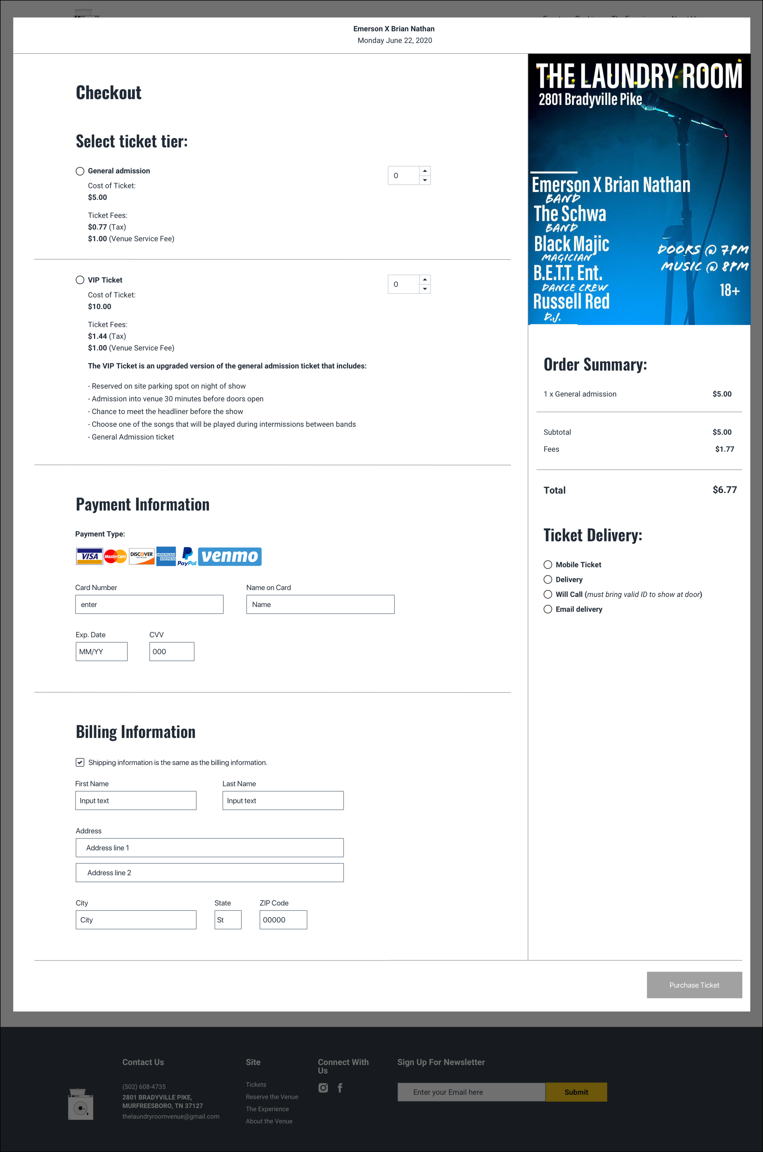
Finally, it was time to add all of the solutions into my wireframes. While doing that I started to add all of the final UI elements. I made some tweaks as everything came together in order to make sure everything worked together well. I ended up changing the amenities section from the experience page to the about us page. Users were split when looking for this feature as to which page it should be on. I ended up choosing the about us page because more users looked there first and most incorrect interactions came from users attempting to click stuff on the about us page.
Final Prototype
Using the Hi Fidelity wireframes I updated my prototype to incorporate the visual elements I added.
Conclusion
Working with a music venue’s website was much more different from clothing website than I expected. From the lack of top tier examples to incorporate into my designs to an entirely new set of user pains, this was a challenge I am glad I undertook. Having loved live music for multiple years, I really enjoyed the opportunity to design and test a website for a music venue.
Next Steps
Update design based on any more feedback received
Test the location of the nearby amenities section if time permits
Hand off to the development team


